
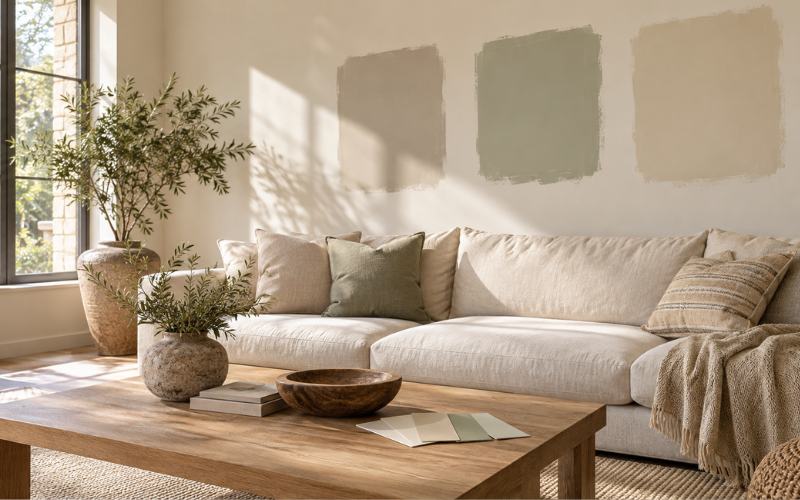
Choosing the best color for living room walls starts with how you want the space to feel. You might want a bright room for family gatherings, a quiet place to relax, or a cozy setting for evenings at home. The right wall color helps create that atmosphere while bringing your furniture, flooring, and other finishes together.
Warm white, soft beige, and light greige are useful starting points if you want a flexible background. Muted green and blue offer more color without necessarily overwhelming the room. Earthy shades and deeper tones can create a richer, more intimate setting.
However, a shade that looks beautiful on a small paint card may look different across an entire wall. Natural light, room size, surrounding colors, and your light bulbs all influence the result. This guide explains the main options and shows you how to narrow your choices before painting.
Best Living Room Wall Colors at a Glance
There is no single wall color that suits every living room. The most useful choice depends on whether you want brightness, warmth, softness, or depth. Start with a color family that fits your goal, then compare individual shades in your space.
| Color family | Overall feel | A useful starting point for | What to check |
| Warm white | Light and welcoming | Rooms needing a simple, flexible background | Whether it looks too yellow beside trim |
| Cream | Soft and warm | Rooms with wood, linen, and warm furnishings | Strong yellow tones under evening lighting |
| Beige | Comfortable and understated | Spaces with brown, tan, or natural materials | Pink or yellow undertones |
| Greige | Balanced and subtle | Rooms combining gray and beige furnishings | Whether it looks dull in shaded areas |
| Gray | Quiet and restrained | Spaces with cooler finishes | Blue, green, or violet undertones |
| Muted green | Gentle and grounded | Rooms with wood and natural textures | Whether the shade becomes too dark |
| Muted blue | Soft and airy | Rooms needing a cooler color direction | Whether it feels chilly in weak daylight |
| Earthy or deep shades | Cozy and expressive | Spaces where a richer atmosphere is welcome | Contrast, lighting, and color depth |
Use this comparison to create a shortlist. The final choice should come from seeing samples alongside the items already in your living room.
Warm White and Cream for a Light, Welcoming Feel
Warm white is a practical option when you want walls that support the rest of the room. It provides a light background for artwork, furniture, and textiles while feeling softer than a very bright white. It can suit both simple modern interiors and more traditional spaces.
Warm white, ivory, and cream overlap, but they are not identical. Warm white usually has a slight hint of another color. Ivory often looks a little richer, while cream generally has a more noticeable yellow warmth. Paint names vary between brands, so compare the actual samples rather than relying on labels.
Your existing white surfaces matter. A wall sample may look pleasantly soft on its own but appear yellow beside crisp white doors or window frames. Hold the sample against your trim before deciding.
If your room already contains golden wood, tan upholstery, and warm lighting, a strongly creamy shade may add more warmth than you want. Try a quieter warm white first. In a room with cooler furnishings, a gentle ivory may provide a pleasing balance.
Beige, Taupe, and Greige for a Balanced Neutral Backdrop
Beige, taupe, and greige are helpful choices when you want neutral walls with more depth than white. They can connect different pieces of furniture and make a room feel settled without drawing attention away from its main features.
Beige usually has a warm appearance, although some shades lean pink or yellow. Taupe often combines brown and gray, sometimes with a violet hint. Greige blends gray and beige, but the balance varies considerably. One greige may look warm and sandy, while another appears closer to gray.
Start by comparing these colors with your flooring. A pale beige might complement honey-colored wood, while a balanced greige could work with furniture that mixes cream and gray. A deeper taupe may provide useful contrast around a light sofa.
Avoid choosing every large surface in almost the same shade. Beige walls, beige upholstery, and a beige rug can work, but they need differences in depth and texture. Slightly darker walls, distinct trim, or a contrasting sofa can give the room clearer definition.
Gray Walls and the Undertones That Make Them Work
Gray can create an understated living room, but choosing it requires attention to the surrounding colors. A shade that looks neutral in the store may seem blue, green, or violet once it is on your wall.
An undertone is simply the subtle color beneath the main shade. Comparing similar paint samples makes these differences easier to notice. Sherwin-Williams explains that colors which appear alike at first can have different undertones, affecting how they coordinate with a room.
Warm gray generally feels closer to beige or brown. Cool gray often has a blue, green, or violet influence. These are useful descriptions, but your room is the better test.
For example, a cool gray may sit comfortably beside blue upholstery and pale stone. Against orange-toned flooring, the same gray may create a stronger contrast than expected. If that contrast feels uncomfortable, compare it with a warmer gray.
Check gray samples beside your sofa and curtains, especially in the evening. Choose the shade that connects these elements and supports the atmosphere you want.
Soft Green and Muted Blue for a Calm Living Room
Soft green and muted blue offer an alternative to neutral walls without requiring a bright, highly colorful room. Their quieter versions can provide enough character to make the space feel personal while remaining easy to decorate around.
Sage often combines green with gray, giving it a gentle appearance. Olive has a more earthy character and may lean toward yellow or brown. Dusty blue is softer than a clear, bright blue, while blue-gray can feel almost neutral in some settings.
Consider how much color you want to notice. A pale sage can serve as a subtle background. A medium olive makes the walls a stronger part of the room’s design. The same distinction applies to a light dusty blue and a deeper blue-gray.
Green can be an appealing partner for wood, cream fabrics, and woven textures. Muted blue may suit white, gray, and brown furnishings. These are starting points rather than fixed rules.
If the room receives little daylight, compare lighter and slightly warmer versions before committing. A shade you enjoy in a sunny photograph may feel quite different in a shaded living room.
Earthy and Deep Colors for a Cozy, Expressive Space
Terracotta, muted clay, deep green, navy, and charcoal give living room walls a stronger presence. They are worth considering when you prefer a rich setting over a light, open appearance.
Terracotta and clay introduce warmth. Softer versions can work as a background for cream upholstery and natural wood, while stronger shades become a main feature. Deep green, navy, and charcoal offer depth with a different color direction.
Painting every wall creates a more enveloping effect. An accent wall concentrates the color in one area. Choose an accent wall because it supports a clear feature, such as a fireplace or the wall behind your sofa, rather than adding one automatically.
Think about contrast before choosing a deep shade. A dark sofa against a dark wall may blend into the background, which can feel restful but reduce definition. Lighter upholstery, curtains, or artwork can create separation.
Good lighting also helps you enjoy the color after sunset. Consider how your existing lamps illuminate the seating area and walls, particularly if most of your living room use happens at night.
How Natural and Artificial Light Affect Wall Color
Lighting is one reason the best color for living room walls cannot be chosen from a screen alone. Daylight, artificial lighting, and paint finish can all change how a shade appears.
Begin by observing your room rather than assuming it is simply bright or dark. Notice which walls receive direct sun, which stay shaded, and when the room feels brightest. Trees, nearby buildings, window coverings, and the depth of the room also affect daylight.
Window direction provides a useful clue. In much of the Northern Hemisphere, north-facing rooms tend to receive cooler, less direct light, while south-facing rooms often receive stronger sunlight. East-facing spaces usually have brighter mornings, and west-facing spaces often receive stronger afternoon light. Local conditions can change these patterns, so direct observation matters.
Artificial lighting deserves the same attention. Warm bulbs may bring out creamy or golden qualities, while cooler bulbs can make some shades appear sharper or cooler. Test with the lamps and ceiling lights you actually use.
Choosing Wall Colors for Small, Large, and Open-Plan Living Rooms
Room size helps guide your choice, but it does not create a strict rule about which colors you can use. First decide whether you want the space to feel airy, intimate, connected, or clearly defined.
For an airy small living room, consider warm white, pale greige, or a light muted color. Keeping the walls and trim relatively close in shade can reduce strong visual breaks. However, pale paint cannot compensate fully for poor lighting or crowded furniture.
A small room can also suit a deeper color if you enjoy a cozy atmosphere. The key is choosing that effect intentionally. Compare a medium shade with a darker version to see how much depth feels comfortable.
In a large living room, a richer neutral or muted color may help the seating area feel more inviting. Large spaces do not always need white walls.
For an open-plan room, consider the views into adjoining spaces. One shared wall color can create continuity. If you use different shades, make sure they work together where they meet, and place changes at clear corners or architectural breaks.
Match the Wall Color to Your Sofa, Flooring, and Trim
Choose wall paint around the features you are most likely to keep. Flooring, a large sofa, built-in cabinets, and stone surfaces usually deserve attention before cushions or decorative accessories.
Look for the color direction in those fixed elements. Does your wood floor lean golden, reddish, or gray? Is your sofa warm brown, cool gray, cream, or blue? You do not need to name every undertone perfectly. You simply need to notice which samples look comfortable beside these surfaces.
Suppose your living room has a camel sofa, medium oak flooring, and cream curtains. Warm white, gentle beige, or muted green could be useful candidates. If you have a blue sofa, pale gray flooring, and crisp white trim, compare balanced greige, soft white, and a quiet blue-gray.
Matching everything exactly is unnecessary. A room often benefits from some contrast, provided the colors relate comfortably.
Check your trim as part of the full combination. Wall paint that looks right beside the sofa may still make existing white trim seem yellow or gray. View the sample where all three meet whenever possible.
Test Your Favorite Shades Before Painting
Once you have a general direction, narrow your shortlist to two or three shades. Too many similar options can make the decision harder, especially when you keep introducing new samples.
Use large samples rather than relying entirely on small chips. Benjamin Moore recommends painted sample boards that can be moved around the room and viewed in different lighting throughout the day.
Place each sample near your sofa, flooring, trim, and curtains. Move it to a bright wall and then a shaded wall. Leave it in place long enough to see it during your normal routine, including the hours when you use the living room most.
Try viewing one candidate at a time after the initial comparison. Several samples crowded together can make you focus on their differences instead of how each works with the room.
Check the intended finish too. A sample product may have a different sheen from your final wall paint. Since finish affects appearance, confirm the selected color in the product and finish you plan to use if there is any uncertainty.
Conclusion
The best color for living room walls is the shade that suits your light, furnishings, and preferred atmosphere. Warm white, beige, and greige provide flexible starting points. Muted green and blue add gentle color, while earthy and deeper shades can create a more intimate setting.
Begin with the features you plan to keep, decide how you want the room to feel, and compare a small selection of samples. Look at them in daylight and under your evening lighting. That process gives you a clearer basis for choosing than a paint name, an online photograph, or a tiny swatch.
FAQs
1. What is the best color for living room walls if I want a neutral look?
Warm white, light beige, and balanced greige are useful starting points for a neutral living room. The best choice depends on your flooring, sofa, trim, and lighting. Compare a few shades beside those features before deciding. A neutral should help the room feel connected, rather than introduce an unwanted yellow, pink, or cool cast.
2. Which wall color can make a small living room feel bigger?
Light colors such as soft white, pale greige, and gentle cream can support an airy appearance. Keeping strong contrasts between walls and trim to a minimum may also help the space feel less visually divided. However, furniture size, layout, and lighting affect the result too. Wall color is one part of making a small room feel comfortable.
3. Can I use dark paint in a living room with little natural light?
Yes, if you want a cozy atmosphere and enjoy deeper colors. Dark paint will not make the room brighter, so consider how your lamps illuminate it after sunset. Test a medium and a deep version of your preferred shade. Compare both with the sofa and curtains before choosing the level of depth you prefer.
4. Should living room walls be lighter or darker than the sofa?
Either can work. Lighter walls help a dark sofa stand out, while deeper walls can give a pale sofa more presence. Similar shades can create a quieter effect, especially when textures differ. Focus on whether you want the sofa to blend in or become a clear feature, then test the wall color beside its upholstery.
5. How do I avoid choosing a wall color that looks wrong after painting?
Test large samples in your actual living room before buying the full amount of paint. View them on different walls, beside existing finishes, and under your usual lighting. Allow painted samples to dry as directed. If the final paint has a different finish from the sample, confirm its appearance before completing the room.